The Brand 19982003
In 1998, Pablo San José decided that his signature would become a brand. He was interested in the processes of artistic signature promotion and in their parallelism with other commercial signatures, and he began a still-ongoing work, a project that constructs itself with each produced piece. “The artist is the brand, the artwork is the product”.
In 2003, Cynthia Viera, a graduate Management in International Business and Marketing, and until that moment the person in charge of Marketing Services in Auna Telecomunicaciones, joined the project, turning into a reality the theoretical intention of working under the structures characteristic of a business, and legally formalizing the team as a commercial brand.
Responsibilities were thus delimited, with Cynthia being in charge of the tasks related to marketing, management and administration, and Pablo taking charge of creativity, theory and production. This structural evolution also decisively affected the type of artwork that has been produced ever since, confronting more complex projects in which experiments are made with language and the procedures of marketing technology in order to reveal their paradoxes and develop a critique accessible to the highest number of persons possible, without neglecting a higher discourse that places these works within the intellectual concerns of contemporary art. A line that PSJM has decided to call “experimental marketing”, which does not seek economic profit as much as the exploration of new channels of artistic creation, always with an eye on social reality, dominated today by the ideology of brands.
1998

The 1998 PSJM brand is made up of two parts created with conflicting mechanisms. We resorted to the almost unpronounceable initials PSJM to impersonalize a name simulating the style of large business mergers. In comparison to this typographical element, a symbol loaded with synthetic realism was added, representing the artist, sitting down, in conversation. An icon that replicates a characteristic gesture of its personal image, since as a producer of art it would be thought that, behind this enigmatic acronym, should appear the man, the artist. The logo began to be used and the brand was created by means of communication, using the works as the as supports of ironic questions about the consumer society.
2003
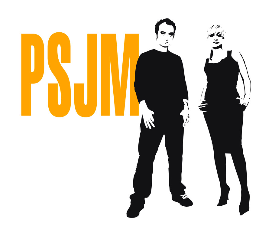
The image of the new formation maintains the name of the old brand in order to build on this capital a necessary updating in the symbol, now denoting the egalitarian meaning of sexes and tasks.

Self-portrait logo I, 2003,
Vinyl, methacrylate and fluorescent
45 x 45 x 15 cm

Self-portrait logo II, 2005,
Vinyl on aluminium and painted wall
58 x 40 cm
Experimental Marketing
Extract from the lecture of the same title given by PSJM in different centres and institutions.